Product
Opening the envelope on Mailgun’s new UI
Mailgun now has a new UI alongside their bulk validations and revamped templates API!
PUBLISHED ON
You’re always looking for ways to do your work more efficiently, whether that means faster troubleshooting or simple tools that help you achieve results more easily.
The Mailgun control panel hadn�’t changed in years, and it wasn’t keeping up with how our offerings have evolved or how we’ve grown as a company since we spun out from Rackspace two years ago. After talking to users about their Mailgun workflows and talking a lot internally about new products we have underway, we realized there were some things we could do to make our user interface more successful.
Aside from a more modern look (which we won’t talk about here, because a new look with no substance behind it isn’t all that interesting to us), there are several noteworthy changes in the new UI that will hopefully make your experience with Mailgun even better.
Table of contents
What you’ll find in the new UI
Clearer groupings by product
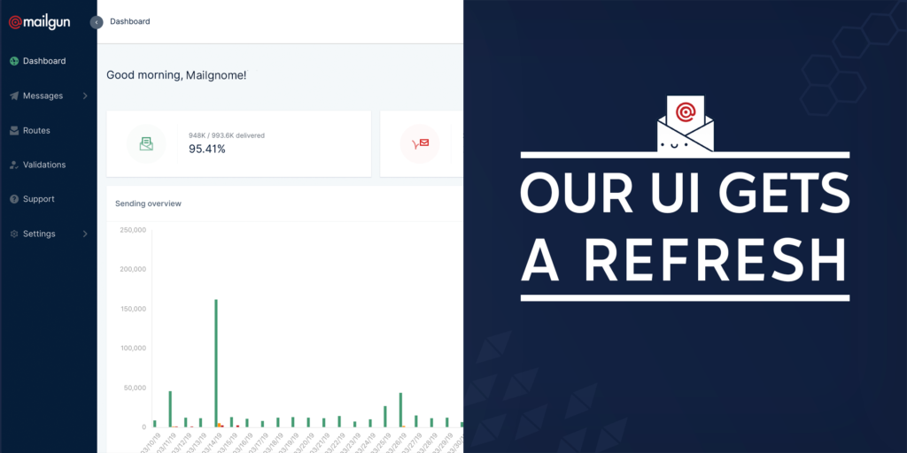
Each major function (“Messages,” “Routes” and “Validations”) now has its own home in the navigation. We moved away from the top-tabbed navigation to a sidebar nav that groups all your tools for sending and tracking emails in one place, all your tools for routing in another, and all your tools for validating email addresses in a third section. In all honesty, we were running out of real estate, and we wanted to make room for new products and features we’ll be launching this year.
Better insights on the dashboard
We’re working on making the dashboard – that first page you land on in the app – more useful. Our devs added performance stats like your delivery rate and bounce rate. We also provided a one-click avenue to your Logs and other tools inside the Quick Links section at the bottom of this page. We’ll have more dashboard changes coming soon, but this is a start.
Easier navigation between EU & US regions
We listened to your feedback on the navigation challenges you were facing when switching between EU and US regions! We’ve consolidated EU and US items (domains, dedicated IPs, etc) into one view, so there’s no more switching back and forth between properties. Hooray!
Your choice of graphs
Different people have different preferences. Surprisingly, this notion is just as useful in UI design as it is in life. You can now choose to view your data as a line graph or bar graph, whichever you find easier.
Usage stats with your billing history
The new control panel gives you more than a record of your invoices and payment history. We also keep track of your monthly usage in the Billing section, so you can have a running log of your messages, routes, and validations processed in a given month.
Nifty alerts so you know what’s happening
Sometimes, in the old UI, you would submit a form or press a button, and it wasn’t exactly clear we successfully registered it. We’ve added a handy dandy, animated notification system to alert you when things are a-changin’. No more second-guessing yourself, which means good things for your workflows and your self-esteem.
Whitelist for bounce suppressions
In order to help protect your sending reputation, Mailgun automatically puts recipient addresses that bounce on a suppressions list so you don’t send to them multiple times. But there are cases in which you might not want that to happen. A good example would be if you’re sending to an archival address or a monitoring address that unintentionally bounces. To help you solve for these instances, we’ve released the ability to add certain addresses or domains to a whitelist. Once you’ve added an email address to the whitelist, we’ll keep that address off your bounce suppressions list. Please note that complaints and unsubscribes will continue to be suppressed. If the address you’d like to whitelist already exists on your bounce suppression list, you’ll need to remove it from the bounce suppression list first.
But what are these new products and features?
You’re smart, so you probably picked up on our subtle allusions to new products and features we’re launching. And exciting news – we’ve got a new product enhancement and a new feature available right now in the new UI.
Meet Bulk Validations
If you’ve got a long list of email addresses to validate (a good problem to have), you no longer have to work up a script to hit our API with each address. Simply upload a CSV of your list, we’ll validate in the background, and you can download your validation results straight from the UI. For those of you who already have a mailing list with Mailgun, you can also validate your list directly from the mailing list view!
This all relies on the new V4 of our Validations API, which makes your validations results a lot easier to read. Check out the docs and our recent post that walks you through the changes here.
Introducing Email Templates
You can now add, store, and edit the HTML for your templates all from within the Mailgun platform. That means you can make a simple call to your template ID when you send an email, and you won’t have to go digging into your code whenever a template needs to be updated. For developers, this also means you can give other internal teams the power to tweak your templates, so you don’t have to waste spend precious time doing it for them. We also have default templates available to get you started. Check out the docs for more details on templates.
Please note that bulk validations and templates are only available in our new UI. You can’t access them via the old control panel. Which makes you wonder…
When you’ll get the new UI
If you sign up today, we’ll automatically put you into the new control panel. No having to learn one interface, only to be thrown into another one a few weeks later, because that’s not cool.
If you’ve been with us for awhile and you’re ready to make the switch, you can try out the new control panel today! We’ve added a bar at the top of the old control panel that invites you to explore the new experience.
We’ll be moving all accounts over to the new UI on April 30th. We will continue to support both control panel environments for several weeks thereafter to make this transition as seamless as possible for you.
Wait, I can’t find something!
If you’re having a hard time finding a certain page or feature, please check out this detailed rundown of the navigational changes and where things have moved.
You might be thinking… this is all great, but what’s next? This is far from the end! It’s only April, and we’ve got a lot more up our sleeves to make 2019 a great year for our users. I’m really proud of our team and what we’ve accomplished in the past year. Here’s to more new things to come…
P.S. We always love to hear your feedback on what you’d like to see improved, added, or changed, so hit up our feedback site and let us know!
P.P.S. For the curious technical souls out there, our new UI is built on Github’s Primer framework, using React.

