Onsite factors that affect your email sign-ups


Michael Akinlabi is the Head of Content at OmniKick. OmniKick is a powerful popup tool. Over 5,000 companies use Omnikick to build their email lists through sign ups on their websites.
Your website is the best places to grow your email list. Customers on your site are already aware of your brand, products, and services, and it doesn’t hurt to ask them for their email addresses if they would like to learn more.
So, is your website optimized for collecting their emails?
If your site isn’t, it’ll be difficult to turn visitors into buyers. Most web users don’t buy the first time they visit a site. They have to return many times and become more familiarized with your brand before deciding to choose your product or service. There are a variety of ways to bring them back and keep you top of mind, but the best way is to get them to sign up for content on your site.
However, you can’t slap a sign-up pop up on your site without any forethought. A variety of factors could be affecting your sign-ups, and it’s important to know what to look out for ahead of time to optimize your sign-up experience:
A Lead magnet is what you offer visitors in return for their email addresses; some examples of lead magnets are white papers, guides, and case studies. Not everyone uses a lead magnet to attract sign-ups, but it does entice website visitors to sign up since you are offering them something. A lead magnet gives them a reason why they should drop their addresses on your site’s opt-in forms.
Your competitors are using lead magnets on their site too. You can’t offer visitors the same thing they see on your competitors’ sites. Offer something better and bigger.
Let’s assume that your competitors are offering an e-book titled “50 Ways to Live Healthier.” Make your offer bigger. Your e-book should list 100 ways. Maybe even 150 or 200. That makes your lead magnet more attractive to prospects.
However, note that the content you are giving them needs to be true and high quality. Those 100 ways to live healthier need to be real, rather than empty copy. Otherwise, you might end up driving that sign-up away entirely.
Remember, web users rarely leave their emails on sites that are poorly designed or optimized. In fact, they can’t wait to leave a site like that since they often times look like spam or fake websites.
When your website has a poor design for either web or mobile, you affect your overall traffic and your email sign-ups. You have to be sure that your website works across web browsers, on mobile, and have an attractive UX if you want to encourage sign-ups and make the process as painless as possible.
If you don’t know where to start, you can visit competitors ’ websites. What are their designs like, and what draws your eye? If you feel that their websites are better than your own, then it’s time for a redesign.
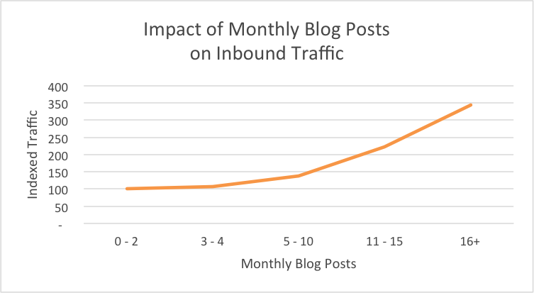
Creating new and exceptional content that educates and enriches your potential customers’ experience on a regular basis is the key to building quality email list that grows over time. Businesses that publish frequently are at an advantage here, since they are adding value month over month or week over week.
When you put out high-quality content, customers will trust your business more and see you as a thought leader in your space. If you need a place to start to build traffic, think about using some SEO tools to find highly-targeted keywords.
A study by Hubspot shows that businesses which invest in content creation receive higher traffic from social media, search engines, and other sites. More traffic means more subscribers.

If you’re currently not publishing content on your site, it’s time to start doing that. Just remember to ensure that the content you publish on your blog is high-quality and educational.
Popups are powerful tools for collecting emails when used correctly, but my favorite is exit-intent popup. An exit-intent popup shows when a visitor is about to leave your website. You can use this moment to present an ioffer to prospects to keep them interested in your content.
But let’s be honest, pop ups can be annoying, and that all depends on how you use them. Displaying a popup when a visitor is about to exit your site is better than using it to disrupt the visitor’s experience. Nobody likes to be reading an article only to have a popup appear out of nowhere.
Plus, If you use pop ups the wrong way, they have an adverse effect on your sign-ups. But if you use them the right way, pop-ups could help you double your email list within a short period of time. Use exit-intent popups to offer those lead magnets I talked about earlier like discounts, free guides, webinars, or a free trial. Your visitor won’t complain if they are getting something valuable when they’re about to leave.
Testimonials are another great way to improve your onsite performance with email sign ups. Customers want to hear from other customers, and testimonials allow you to let your actions speak for you.
Use testimonials in text, audio, and video formats on your site, and be sure that your testimonials showcase the speaker above all else. Include photos of the customer when needed, and always make sure that you have approval from the customer to use their testimonial and imagery.
Before I close this out, let’s review what I’ve covered so far in regards to onsite factors affecting your sign-up experience:
And that’s it! If you follow best practices before and after sign-up, conform to rules and regulations like GDPR, and following CAN-SPAM while sending emails, you’ll build an engaged email audience in no time.